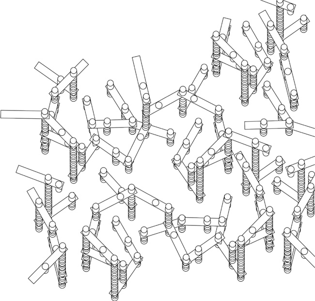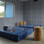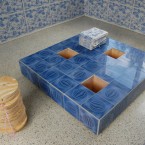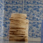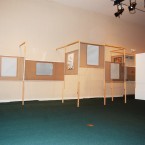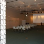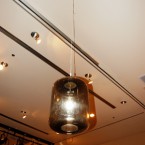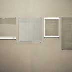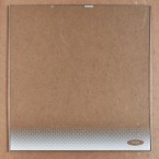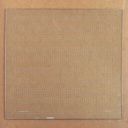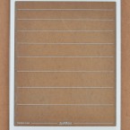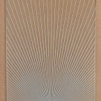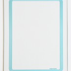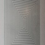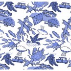
- Gean Moreno and Ernesto Oroza. Untitled (decoy), 2010. Wood and found tiles. Functional object 48” x 48” x 12”
- Gean Moreno and Ernesto Oroza. Untitled (decoy), 2010. Wood and found tiles. Functional object 48” x 48” x 12”
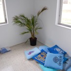
- Gean Moreno and Ernesto Oroza. Untitled, 2009. Cushings, T-shirts and refills, 16×16 in each
- Tonel. Telarte pattern for Tabloid 8, 2009. newspaper
- Gean Moreno and Ernesto Oroza. Studio Scrap Stools 2, 2010. plywood
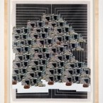
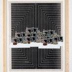
- Gean Moreno and Ernesto Oroza. Untitled, 2010. Newsprint and printed matter
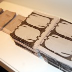
TABLOID #8: This tabloid was produced by Gean Moreno and Ernesto Oroza for the exhibition DECOY. Farside Gallery 2010. Miami, FL.
Textile pattern by Tonel, mass produced as part of the cultural initiative TelArte, Havana 1987, altered by Gean Moreno and Ernesto Oroza, 2010.
Special thanks to Tonel for allowing us to use his work.
8 pages. Blue. Edition of 1000
From press release:
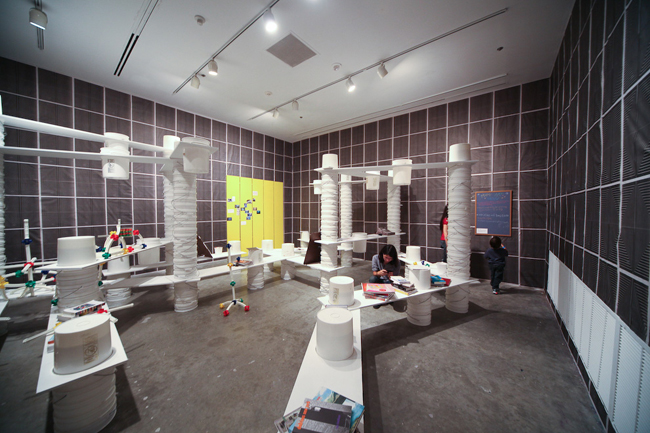
(Miami, FL) -For the exhibition Decoy, Ernesto Oroza and Gean Moreno are producing an abstracted interior in the guise of a reading room. In it, nothing is what it seems: a graphic/decorative figure is actually a schematized image pulled from a partially successful effort to join art and mass production (TelArte); the typology of a bench is folded into that of a table which, in turn, is folded into that a display structure; a set of funky tiles stand in as shorthand diagrams of procedures witnessed at the local salvage yard from where they were reclaimed; a tabloid (as a medium for information distribution) is inseparable from a wallpaper as a decorative structure, but the wallpaper presents its own non-decorative information; cushions sewn out of old T-shirts double as a starting archive of graphics that have taken root in our vernacular landscapes. Things acquire two and three identities and negotiate precarious balances between them. Somewhere in all this, one can begin to discern what is important to Oroza and Moreno: crisscrossing functional patterns in order to produce astute artifacts; testing the possibility of objects feed on tactical logics which, despite their proclivity for tending to the necessary with impressive economy, are all-too-often relegated to one kind of margin or another; formulating tentative theorems on what possibilities are still viable and vital for object production and urban experience.
MODELS OF DISPERSAL: Notes on the Tabloid project
Gean Moreno – Ernesto Oroza
Some old women use newspaper to dye their gray hair. They rub the pages insistently on strands of hair until the ink dust released seeps all the way down to their follicles. Afterward, the new blackness, so deeply entrenched at first, slowly abandons their heads and stains the pillow cases. In the washer, these pillow cases stain the rest of the clothes that they’re spinning with. A dark color starts spreading inside the house. Ink that not a week ago had been employed to convey timely information is reconfigured as vague spots on the grandchildren’s uniform shirts and as a new shade on the son’s once-white work pullovers. But the inked water, as this is happening, has already left behind the domestic space. Through the foam expelled by the washer, and running down the different drainage systems, it expands infinitely. A river of inked water roars through the plumbing, and eventually escapes through corroded pipes, faulty unions, and cracked elbows, and invades the city.
Each washer is just a single source of this inked water, but there are thousands of them in the city. Imagine them synchronized, erupting simultaneously from the penthouses on Brickell Avenue, from the backyards in Hialeah and the hospitals in Allapatah, from the women’s prison on Krome Avenue, from the shotgun houses in Overtown and the pseudo-Moroccan single-family homes in Opa-Locka, from kitchens in Little Havana duplexes. Suddenly, there would be innumerable tributaries, feeding on one another. The entire city, in this situation, is recast as a tidal basin. Currents would constantly gain strength. Eventually, they overflow the streets and other existing axes that channel them. Tributaries merge. The inked water and the foam begin to slip under doors, seep through the crevices in solid walls, run off into sewers and canals until they overflow these too and continue to move.
Puddles remain in the wake of the foam and impure liquid. Their waters fill the grooves in truck tires and are pulled all the way to the port and onto ships running cargo across the sea. They also splash when messengers and food delivery folks race over them with their bikes and scooters. The packages they are carrying are soaked. This is how the inked water climbs through the hollow shaft of the elevator into office towers and stains the curtains in the conference rooms, the carpet, the linoleum tiles in the break rooms.
As the puddles grow shallow, dispersed, the wet asphalt still manages to blacken the soles of students’ shoes as they, wearing shirts their grandmothers stained in the wash, cut across empty lots and fenced properties, carving new paths through the city, in order to get to schools and vocational centers on time and avoid afternoon detentions.
As the water finally evaporates completely, it leaves behind an ink residue, a black powder like the one that some old ladies tease out of newspapers to dye their gray hair. This black powder–the routes it marks–draws a new map of the city. These currents of inked water are real of course; they spread across the memories and imaginations of any child that has seen grandma dye her hair with newspaper, that has seen the smudgy stains on her pillow case, the stains on his/her own uniform shirts. But they are also virtual. These are currents that mark a physical passage as much as they mark the movement of a series of habits, of traditions, of vernacular and familial practices, of knowledge that has been handed down from one generation to another, taken from one geographical context to another. They are channels of information. Just as the lines that mark the large systems of distribution that tabloids employ are also channels of this sort. These, too, are real; they’re there, even if they have no continuous physical manifestation. They are one of the city’s invisible materialities, a virtual channel for one of its flows. They are plotted only by the spots where users pick up their tabloids, by the habits that drive these users to go every week to the same place, expecting new stories but always within a series of specific and familiar graphic parameters. These systems of distribution draw a new city over the grid that we find on the dusty maps and diagrams employed in architecture and urbanism schools.
Employing a standardized typology, our tabloids slip into the systems of production and distribution in which this typology is a central component. Or rather, they emerge–as a kind of altered offspring, a teratological experiment–from these systems. For a project in Quebec City last spring, for instance, our tabloid was inserted (dissolved) in the city’s free weekly, VOIR. It existed in a run of 15,000 copies, spread through a series of delivery routes that covered a significant portion of the city. Our tabloid–no longer an autonomous artifact, but grafted like a parasite to a temporary host–exploited a massive system of efficient distribution which, on the one hand, dispersed it throughout the city and, on the other, tapped into habitual behaviors of the local population to further enlarge the territory through which the tabloid travelled.
But, as a parasite, the tabloid may burrow deeper than these distributive systems. It may tunnel down into the substructures of the standard tabloid, into the very codes that organize it as both a cultural/social artifact or sign and a unit within a productive system.
The newspaper printer is, above all, a distributor of multiples, of identicals, in the same way that a machine for injecting plastic or one for stamping metal can be this. Reconsidering such a system in its pre-cultural moment, that is, suspended before the usual social function of its products has been enabled, allows us to insert an altered product with an altered social function. With this alteration, the system multiplies an object that is different from the one it usually produces. But the multiplicative and serial mode of production is essential here. Its logic cannot avoid marking the parasitical “material.” Knowing this, one has to consider how this multiplicative or serial element may be employed fruitfully. One works with it. And what products can better exploit processes of multiplication than those with the capacity to organize themselves modularly, in potentially infinite spreads; objects that can couple into larger continuums that themselves become new and different objects? A modular pattern printed on a tabloid page is pregnant with inexhaustible potential. The pattern favors and can participate in the configuration of a plane or a structure. It compels all the identical units spit out by the printing press to produce a condition–emergent in the relationship between them–that is greater than the individual object and that exists at a distance from the individual object’s usual moment and form of consumption.
Methodologically, the project may deal less with the alteration of a generic product than with a “genetic” intervention in its productive substrate, with planting an invasive cultural sign in the optimized space of generic production. With an awareness that the qualities of this invasive species are prone to themselves, due to the very nature of the system they have taken as host, take on a generic character; they, too, like any generic object, will be optimized to the point of abstraction, to where they take on the condition of something inevitable in the city, like linoleum tiles, drop ceiling tiles, and sheetrock panels.
In Quebec City, we employed a schematic version of a vernacular decorative pattern that we found on the facade of a house in Little Haiti–a spread of banal faux stones. A question quickly emerged: How can this pattern overcome its suspicious quality as a parasite? How does it slip into a kind of normality, of “genericity”? It has to exploit ambiguity, reappropriate familiar codes. The insertion of a foreign sign (say, the reproduction of false stones) needs to be associated to a text or some other common element in the language of the newspaper. It needs to activate other functions, be they indicative, illustrative, commercial, or documentary. The pattern, as foreign or intrusive element, remains exceptional but within a very familiar and schematic structure. It can’t obviate the defining qualities of the typology it has invaded. One imagines that a tabloid that is all patterns or that is highly idiosyncratic in some other way always risks becoming the sort of graphic project that is produced for the protected space of galleries and museums–its meaning and autonomy upheld at the expense of the social function and mobility of the typology it appropriates. Something vital, the way the tabloid moves through the city, simultaneously unseen and ubiquitous, organically woven into the urban flows, would be irrevocably lost from such an iteration of the tabloid. Its condition as a vector of information, as a familiar structure, as a natural inhabitant of an urban ecology, as an artifact that is embedded within the larger economic forces of the city–in short, all that is interesting about the tabloid–would be smeared out of the picture or diluted to a sad and unimportant state.
In the text that accompanied the pattern inserted in the Quebec City weekly, which sought to mimic (in structure, if not in content) any run-of-the-mill tabloid article with its geometry of columns and requisite accompanying photos, we spoke of a running surface of plywood sheets that was covering certain sections of Miami in the wake of a massive wave of home foreclosures. Banks seal empty houses with plywood sheets over the doors and windows to keep squatters, junkies and thieves out. Many people in Quebec associated, strangely to our ears, the rock pattern produced by Haitian immigrants (as a microscopic version) to the multiplying plywood plane. One, the rock pattern, we thought, was an effort to claim at the level of the home and the family, and by deploying a decorative structure, space for a particular value system. The other, the plywood sheets, we thought as potentially endless urban wallpaper that spoke of the massive force of an economic crisis. In fact, we propose in the text that the knots and the grain of the plywood added up to the repeating “decorative” pattern of a catastrophe that no one could figure out how to avert. The goal in bringing these two very different patterns (and worlds) together was to highlight different patterns of expansion–patterns that, in their forceful multiplication, in the ineluctable character that their growth assumed, served as metaphors for the way we imagined our tabloid–and tabloids in general–spreading through the city.
There is a virtual or abstract plane, after all, on which the 15,000 modules distributed in Quebec City can be collected. On it, they produces an enormous alien surface that threatens to blanket the entire city. Like the snow that covers its streets every winter, but climbing the city’s vertical surfaces instead. There is also a map–perhaps not yet drawn by real all the same–of the truck routes through which VOIR is delivered. There is a potential drawing that documents the distribution points where the stacks of weeklies are dropped off. It would be made up of the doorways and stoops in front of bars, record shops, bookstores, cafes, stores, fast food restaurants, cultural institutions, and student centers. Maybe it’s just a set of coordinates or address numbers. Each of the metal stands and bins in which VOIR is kept inside these spaces, in turn, is a node in yet another possible sketch of tangled trajectories.
There is, finally, an imaginable theoretical plane, a narrative space, on which the final consumption and use of the pattern can be documented. One imagines the Little Haiti rocks, having migrated north, further north that is, used as wallpaper in a record store, in a dorm, in the bathroom of a bar; or used as a doile or as a book cover. As a picture frame. The pattern can be used to wrap beer bottles outside the bodegas where it is illegal to loiter and drink. It can be employed to cover and replace dislikable or outdated posters, to run over bare city walls, and to wrap around telephone poles lined with unpalatable concert flyers and record release party announcements. It can be used as a decorative layer over the glass of all the empty storefronts in a faltering mall. It would certainly brighten the mood of the place. It can cover the plywood sheets that seal homes that have been foreclosed on or the rottiing wooden fences around abandoned construction sites. It can be used by some old ladies to dye their gray hair.
Once the information vectors of Quebec City were contaminated, the expansion of the Little Haiti rock pattern threatened to be endless, to dissolve into the city.
Gean Moreno and Ernesto Oroza. Miami-Dade Public Library System – Main Library, Miami. June 10, 2010.
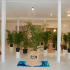
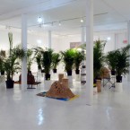
- Installation
- Installation
- Installation
- Tabloid #9
- Installation
- Collection of found refrigerator trays
- Found refrigerator tray
- Found refrigerator tray
- Found refrigerator tray
- Found refrigerator tray
- Found refrigerator tray
- Found refrigerator tray
Curatorial Statement:
Driftwood – Gean Moreno and Ernesto Oroza
Thursday, June 10, 2010
Miami-Dade Public Library System – Main Library
101 West Flagler Street Miami, FL 33130
Gean Moreno and Ernesto Oroza’s collaborative works question, test and “act out” ideas about the function of and tensions between objects, cities, exhibition spaces, art, architecture and design. Often visually simple and sparse, their projects for exhibition spaces have many layers.
These projects challenge the premise of design and artistic production, complicating our understanding of the relationships between makers and users. How do cultural influences, economic necessity, or any number of social, natural or political forces lead to new and unanticipated uses of places and things? What can we learn from the way ordinary people make use of milk crates, stereo speakers, buckets? What do we understand about changes in a city by looking at its salvage yards and civic auditoriums? Who or what makes a particular use or design official?
The artists write about these observations and publish them in newsprint tabloids that they distribute publicly as well as in art journals for specialized audiences. The ideas in these texts inform their visual/design projects; the tabloids become part of installations. These ideas also trouble the connections between the materials in the gallery or art journal—validating spaces—and their counterparts in the city and society outside.
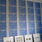
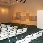
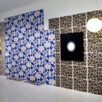
The objects and materials in Driftwood act as double (or triple, or quadruple) agents. The wallpaper, screen structures, event posters and glass “paintings” extend or bend the energies at work in a Miami salvage yard and urban patterns of use: they are both art objects and salvaged/functional materials. They also modify the space, laying bare its functions: an institution has decided to use a space designed to be an auditorium or meeting space as an art gallery.
The patterned wallpaper is also a vehicle for discussing ideas. It folds into a tabloid containing an essay with images, Thirteen Ways to Look at a Salvage Yard, and a page that collapses into yet another publication, Freddy: examining the process by which a mass-produced object gets “derailed” for new uses. You’re invited to pick these up and take them with you—to read or to use for something else.
Denise Delgado.
Curator.Art Services and Exhibitions
Miami-Dade Public Library System
Artist of the Month of October 2010
October Curator: Rene Morales
INVISIBLE-EXPORTS
The Bridge Downtown interview here
The Bridge Downtown
Posted on October 10, 2010 by theartistofthemonthclub
Selected by Rene Morales, Associate Curator at the Miami Art Museum, October’s Artists of the Month are Gean Moreno and Ernesto Oroza. Here, we talk about their six-tabloid digital print edition.
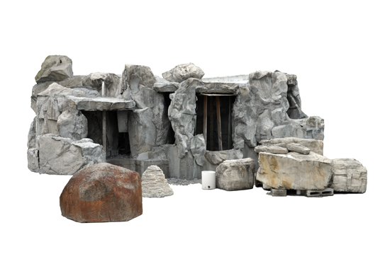
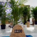
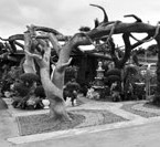
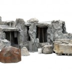
Q: What is the stone structure at the center of the image?
A: The stone structure is an artificial grotto that we found in a landscape nursery. We are using it as a stand-in for what we are calling the pre-city. This pre-city is a kind of abstract plane made up of recurring shapes and materials and colors, filtered through sedimented accumulation of zoning and building codes, that determine what the city will look like. We think it’s there in the repeating vegetation and garden ornaments in plant nurseries, in the prefabricated trusses in the roofing company, in the standard metrics according to which everything is cut in the building materials depot. It’s as if all the different shapes that will make up the city find in these objects their elementary particles. All that we need is to put the individual parts together and we end up with a city like Miami.
Q: The pre-city comes to exist through a filter of regulation, but what about demand and necessity? Could that be as essential as regulation to the accumulation of a city?
A: The city, as a generic structure, happens at the interface between different forces. One of these is represented by regulation, legal precedent, climatological and other adaptations, and the habits of the citizenry. Another force is embodied in the myriad forms and metrics of what we call the pre-city. And yet another is taste/demand. We think of taste not in relation to some endowment to recognize or enjoy the “good things” in life, but as the manifestation of the systematic demands of a particular social group. These different forces are often interdependent, but it is at the points where they meet head-on that the city’s morphologies emerges.
Q: How does it relate to the format of 6 Tabloids?
A: If the pre-city opens a parenthesis, there is a post-city that closes it. Between them, however, there is only an absence where the traditional city once unfolded. We think of places like the salvage yard and the souvenir shop as part of this post-city. It’s not so much where waste goes as were things are deposited which index a change of fashion or building codes, an error in production, or an over-distillation of meaning. These places are almost like large sedimented scabs.
Q: Okay, so you are saying that the junk – souvenirs and waste are junk, just in different ways – becomes an index of expired tastes and needs? That what we either discard as trash or commemorate as kitsch (like snowglobes and miniature Eiffel Towers) could tell an outsider about a city’s consumption patterns? Or do you mean something different than that?
A: Well, within the examples we gave there are certain differences. Although we consider both part of what we are calling a post-city, the salvage yard and the souvenir shop behave in different ways. An important distinction we want to make is between the landfill and the salvage yard–or amorphous junk and the kind of diagrammatic reading that the salvage yard affords us. In the salvage yard one can discern a number of legal, technological, and social changes. A proliferation of doors, for instance, may index a change in building codes. There is also in the way that the salvage yard functions as a commercial entity this process of evacuating cultural value from artifacts, so that they again return to a condition of raw material. One can image the endless rows of pink and pastel blue toilets in the salvage yard morphing into the terrassae that fills in the mosaics in the children’s museum. Garbage, on the other hand, seems to take on its own hard symbolic qualities.
The souvenir shop is different. On the one hand, it participates in the post-city as a kind of trader in dead meanings. It portrays, on the surface, the city not as a lively generative matrix of forces, but as a symbolic construct. It employs widely-shared conventions. Yet, on the other hand, the souvenir, as part of a massive productive system, in the challenges it puts to our safeguarding of stable identity, seems more up-to-date than most objects. It understands generic production. It treats identity as something that is “stamped” on a set of generic artifacts. It invites us to consider a new notion of city-identity, one that is perhaps is more attuned to our global trading networks, our massive communicative infrastructures, and the proliferation of generic production. While it houses obsolete symbols, it seems ahead of most things in its understanding of contemporary production. In this way, it closes the loop: it is both part of the post-city in its tired semiotic inventory, and it is part or emblematic of the pre-city in the understanding of morphologies and processes of the generic.
Q: That’s a fascinating concept, that the souvenir can be a lingering signifier of a city, while it also can be a building block for the inchoate pre-city. Today’s gift shop is tomorrow’s salvage yard. Given your interest in trading, communication, and production at the global level, why do you take on the “the City” as your subject?
A: But there is no difference between the city and the global networks of trading, communication and production. Or another way to say this: cities are just points of compression in these networks.
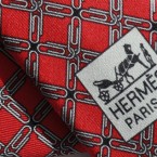
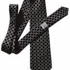
Cravate design for Hermès
‘Les cravates par Hermès’ competition (Hermès/designboom).
Third ex-aequo prize
‘cleverness patterned‘ in colaboration with Liliam Dooley
(more info)
Sold out.
- cleverness pattern tie
- cleverness pattern tie
- cleverness pattern tie
- original design
- cleverness pattern tie
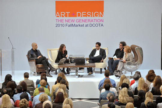
FALL MARKET AT DCOTA
ART + DESIGN: THE NEW GENERATION
WEDNESDAY NOVEMBER 10, 2010
To download the Fall Market Program (PDF): Click here
11:00 a.m. ArtNexus Keynote: Investigating art and design, what is now, with tastemakers of the new generation: Dror Benshetrit, Anna Busta, Ernesto Oroza and Gean Moreno. Moderated by Art Nexus Editor in Chief Celia Birbragher. Reception at Adriana Hoyos.
2:00 p.m. Design Miami Preview: This global forum for design opens in December. Enjoy a preview of objects and objectives with Wava Carpenter and Alexandra Cunningham of Design Miami/.
5:00 p.m. Showroom Launch Party: Celebrate teh launch of the new exclusve Andrew Martin showroom at DCOTA. THe Edgy-Brit brand makes its mark in South Florida this season. Cocktails & Hors d’oeuvres served.
4:00-7:00 p.m. Design House Kick-off: Meet the designers and view the inspirations for this season’s upcoming DCOTA Design House, Film + Design The Golden Age of Hollywood at Brown Jordan.
Over 30 showroom programs and open house events. Visit dcota.com for full schedule.
TABLOID BY GEAN MORENO & ERNESTO OROZA http://thetabloid.org/
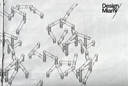
Miami based artists Gean Moreno and Ernesto Oroza have created a designfocused tabloid in honor of Design Miami/ 2010, featuring interviews, sketches, posters and essays by important forces in the design world such as Andrea Branzi, Hans Ulrich Obrist, Martí Guixé and Jerszy Seymour. To go along with the free publication, which will be distributed at the fair as well as key points throughout the city, Moreno and Oroza have designed a limited run of bags and t-shirts that reinterpret the Design Miami’s trademark logo. (from Design Miami 2010 program)
Contributors: El Ultimo Grito, David Enon, Kueng Caputo, Catherine Geel, Martí Guixé, Hans Ulrich Obrist, Octavi Rofes, Jerszy Seymour, Jens Thiel
Download pdf
- Desobediencia – Textos Moiré – 2010
- Desobediencia – Textos Moiré – 2010
- Desobediencia – Textos Moiré – 2010
- Desobediencia – Textos Moiré – 2010
Desobediencia.
This publication accompained Ernesto Oroza’s participation in the exhibition International Caribbean Triennial. Santo Domingo, Dominican Republic, 2010.
Content:
La estética del progreso y la desobediencia tecnológica . Ernesto Oroza
Objetos Moiré. Gean Moreno-Ernesto Oroza
Zine (newspaper folded)
Printed in Florida, US. 1st edition in a run of 1000 copies.
Language: Spanish.
21.5 x 14 cm, 32 pages
Textos Moiré © 2010
Curatorial Statement by Rene Morales
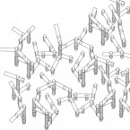
The work of Gean Moreno and Ernesto Oroza revolves around two central interests: the social forces that shape the urban landscapes, and the idea of tapping into what they term the “preexisting infrastructures” that they have at their disposal as artists working on a project-to-project basis.
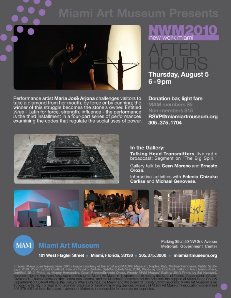
When they were approached by MAM to participate in NWM2010, they identified the museum’s tradition of publishing “gallery notes” for each exhibition and proposed folding the content of the brochure (curatorial essays, a calendar of events, sponsors’ logos, a survey questionnaire, etc.) into the ongoing series of tabloid newspapers that they produce as part of their commissions; they consider these publications to be the primary elements of their projects.
The lower expense of the tabloid format allows for the publication of three 16-page editions (one for each month of the exhibition), which will be distributed at several locations throughout the city.
A Better World by Design
Brown and RISD students converge to inspire international community for social change
Providence, RI to host annual “A Better World by Design” Conference October 1-3, 2010 October 1 – 3
Workshop: Technological Disobedience by Ernesto Oroza- Saturday from 5:30 to 7pm –
Petteruti Lounge in Stephen P. Roberts ’62 Campus Center – Brown
- Installation View, 2010
- InstallationView of Tableaux (w/ Beatriz Monteavaro, Bhakti Baxter and Aranda/Lasch),2010, Tabloid, painting, fern and scotchtape lamp
- Installation View, 2010
- Untitled (Address Rock Lamps)2010, Faux rocks, electrical equipment, souvenier towel. Dimensions variable
- Untitled (Grotto) 1 , 2010, Printed matter 21” x 26.5”
- Untitled (Grotto) 3, 2010, Printed matter 21” x 26.5”
- Research image, 2010
PRE-CITY
Gean Moreno and Ernesto Oroza
Gallery Diet 174 NW 23 St Miami, Fl, 33127
October 9, 2010 7 – 10 pm
Gallery Diet is pleased to present Pre-City, a solo exhibition of collaborative works by Gean Moreno and Ernesto Oroza. With the works in this exhibition, Moreno and Oroza speculate on what they call the pre-city, a kind of abstract plane or pliable region made up of the different shapes and materials that determine what the city will look like. They propose that the city is already compressed in the range of materials, repeating objects and standard metrics found in construction material depots, lumber yards, roofing companies, landscaping nurseries, and home improvement stores. The pre-city is a series of codes that have yet to be arranged and coupled into larger assemblages. The exhibition will include “diagrammatic lamps”; “photographs” made out of materials printed in newspapers, magazine and catalogues; a new tabloid; domestic tableaux; and collages.
Moreno and Oroza have exhibited their work at the Quebec City Biennial, Miami Art Museum, Bass Museum of Art, Spanish Cultural Centers in Miami, Montevideo and Mexico City, Invisible Exports in New York and other galleries. Their texts have appeared in e-flux journal, Monu-a magazine for urbanism, and the catalogue Spatial City, produced by Platform (Regroupement des Fonds régionaux d’art contemporain, France) and Inova (Milwaukee). Both artists have also exhibited individually. Oroza’s work has been seen at MoMA (NY), Groninger Museum (The Netherlands), Tate Modern (UK) and Laboral Centro de Arte (Spain). He is the author of Objets Réinventés. La création populaire à Cuba (Paris, 2002) and Rikimbili. Une étude sur la désobéissance technologique (St. Etienne, 2009). Moreno has exhibited at North Miami MoCA, Kunsthaus Palais Thum and Taxis in Bregenz, Institute of Visual Arts in Milwaukee, Haifa Museum in Israel, and Arndt & Partner in Zürich. In 2008, he established [NAME] Publications, a platform for book-based projects.
Gallery Diet is a contemporary art gallery located in the Wynwood District of Miami, Florida where it has existed since 2007. The gallery has produced over 25 solo and group exhibitions by new and emerging artists from around the world and has documented those exhibitions in hard cover print on a yearly basis. Represented artists include Charley Friedman, Christy Gast, Richard Höglund, Abby Manock, and Daniel Milewski.
For additional information or images please contact info@gallerydiet.com or 305.571.2288
GENERIC OBJECTS
Gean Moreno & Ernesto Oroza
“Gean Moreno and Ernesto Oroza articulate the world of generic objects sculpted by the brutally abstract flows of trade logistics, global exchange, and abject necessity. They key into a type of formal engagement that not only bypasses and supersedes modes of display, but also considers concrete object-production in terms of a kind of “meta-author” working at the intersection of small-scale need and worldwide processes of industrial standardization. “What is most interesting about the generic quality is that it clarifies objects as compressed and manipulable energy and information, free of the magical cloak of meaning and added value with which the fairy dust of sanctioned creativity wraps them.””
OFF THE RECORD at Edge Zones Art Center-Miami
Curated by Anonymous Curators
Pavel Acosta/ James Bonachea/ Carlos Caballero/ Celia & Yunior/ Ana Teresa Fernández/ Núria Güell/ Glenda León/ Yasser Piña/ Ernesto Oroza/ Katiuska Saavedra/ T10
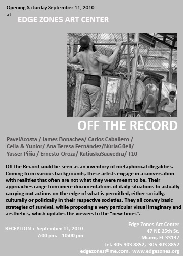
Off the Record could be seen as an inventory of metaphorical illegalities. Coming from various backgrounds, these artists engage in a conversation with realities that often are not what they were meant to be. Their approaches range from mere documentations of daily situations to actually carrying out actions on the edge of what is permitted, either socially, culturally or politically in their respective societies. They all convey basic strategies of survival, while proposing a very particular visual imaginary and aesthetics, which updates the viewers to the “new times”.
47 NE 25th St., Miami
305 303 8852
SEPTEMBER 2010
CULTURAS VERNÁCULAS Y CANIBALISMO SÍGNICO.
Ernesto Oroza, 2010
Charla durante las XVII JORNADAS DE ESTUDIO DE LA IMAGEN. EL SUSURRO DE LAS IMÁGENES / 21 – 25 JUN 2010
Dirigidas por Aurora Fernández Polanco
La cultura popular no es lo que se llama técnicamente de folclore, sino el lenguaje popular de permanente rebelión histórica.
Glauber Rocha [1]
Escudándome en el tema de las 17 Jornadas me he atrevido a enlazar empíricamente un conjunto de reflexiones y eventos hasta hace poco dispersos e inconexos. Inicialmente eran sospechas disociadas entre ellas, después vagas descripciones aisladas que se tornaron comunes, repetitivas. Hablo de un gesto, un comportamiento que progresivamente se hizo recurrente y ubicuo, apareciendo en sistemas muy diversos que había estado estudiando. Tanto en el ámbito precario de la Arquitectura transformada de la Habana, como en el Pequeño Haití de Miami donde los individuos (casi todos haitianos) sobreviven como inmigrantes en un contexto rebosado de objetos genéricos e infraestructuras eficientes y normadas. Se trata de un proceso de reconversión en materia prima de todos aquellos elementos que sin distinción integran no solo la cultura material sino también al universo simbólico. Precisamente por los días que estudiaba y escribía sobre este tema vi un documental: Grizzly man, de Werner Herzog. Casi al final un primer plano del rostro de un oso y un comentario conclusivo del autor me provocaron, y cito: “Lo que me persigue es que en todas las caras de todos los osos que filmó Treadwell, no veo ningún rastro de familiaridad, ni entendimiento, ni piedad. Solo veo la indiferencia abrumadora de la naturaleza. Para mí, no existe el mundo secreto de los osos. Y esta mirada en blanco muestra que solo les interesa la comida. Pero para Timothy Treadwell, este oso era un amigo, un salvador.”[2]
Me estimuló en primer lugar la coincidencia. He usado términos como autista, abrumador, abstracto e indiferencia social, para describir los procesos de producción y circulación de objetos genéricos como la caja de leche (milkcrate) y la cubeta (buckett). Al escuchar a Herzog comprendí que el torrente abrumador de la naturaleza y el torrente abrumador de la producción estandarizada racional y genérica parecían compartir un rasgo común en su relación con los individuos. Unas semanas después en la escuela de arquitectura de Saint Etienne participando en una mesa redonda con el arquitecto Rudy Ricciotti titulada “La Norma”, lo escuché basar su crítica en argumentos sobre como las normas (hablo de normalización) aplastan la cultura y borran la memoria. Explicó como en Francia, los burócratas con la creación e instrumentación de las normas, impiden la inscripción del autor e incluso de los valores locales en los edificios. La norma borra la memoria. Ricciotti, utilizaba esa y otras frases para incitar al público de estudiantes de arquitectura a luchar contra la burocracia que desvanece los valores culturales, desterritorializa las producciones materiales y simbólicas. Sentí desde mi posición, que reconozco ajena a su contexto, que su reclamo tenía también una dosis de desesperanza, impotencia y desgaste. Percibí en su posición un excesivo esfuerzo, una sobre estimación de la burocracia como un enemigo cultural y una respectiva subestimación de las capacidades de los usuarios para apropiarse del producto normalizado y producir significados.
Mientras lo escuchaba pensé en Timothy Treadwell el personaje en el documental de Herzog. El hombre había pasado trece años visitando a los osos, convirtiendo esta convivencia en una emisión televisiva sin basamento científico que sostenía en una supuesta relación afectiva con unos osos que después se lo comerían. Timothy, en algunas secuencias, aparecía durmiendo en la montaña abrazado a un osito de peluche. Y ese fue el segundo estímulo en el documental de Herzog, me descubrí más identificado con la mirada del oso que se lo había comido que con Timothy. El oso parecía haber respondido fielmente a su propia naturaleza. Timothy por su parte se había construido un mundo afectivo irreal e irresponsable. Su relación con el oso estaba pautada por una idealización de la apariencia amigable del animal. Timothy pretendía moverse libremente en el escenario simbólico que el había creado despreciando la fatalidad que nos imponen las reglas del mundo natural. En su mente flotaba sobre la pradera abrazado al amigo oso y éste le devoró antes que la fuerza de gravedad lo despertara bajándolo de vuelta al mundo real.
Estas dos historias: Rudy vs La Norma y Timothy y el Oso tienen mas puntos de contacto que los que vemos a simple vista. En primer lugar ambos subestiman al oso: ambos descreen de las fuerzas y urgencias del mundo natural. El oso en la historia de Rudy es el individuo que el considera será aplastado por la Norma. Cuando tuve que responder a sus argumentos, recordé a los haitianos, mexicanos y cubanos recién llegados a Miami. Individuos, que empujados por la urgencia se sirven sin prejuicios y con temible “naturalidad” de las producciones normadas y súper optimizadas tanto como lo harían de la naturaleza. Y es que el proceso de reconversión en materia prima en ambos universos parte de una condición común: ambos adolecen de identidad. Ambos parecen ajenos al sistema de producción de sentido que es la cultura. Una caja plástica para distribuir leche, es un objeto abstracto, autista, volcado hacia a un círculo de exigencias muy específicas, y es, por su excesiva producción, un objeto accesible. Me pregunto si esta descripción no encaja con la de una rama o una piedra. Ciertamente la caja tiene inscrita una función social pero su concepción se ha optimizado a tal grado que lo humano es solo un valor, un dato dimensional en la superficie plástica del objeto, tanto como lo es el peso de un litro de leche o la capacidad de almacenaje del camión. El milkcrate es un campo sembrado de cualidades físicas, de potencialidades que se harán más visibles en la medida en que estemos más necesitados, pero es también un campo vacío de significados, su figura es tan silenciosa en términos de imagen que su vacío abruma. La caja viaja llena y regresa vacía, participa de un loop que podría permanecer activo por siempre. Si una caja sale del loop, por pérdida o deterioro, otra ocupará su lugar. Si el mundo se detuviera, el loop que dibujan las cajas de leche en la ciudad seguiría fluyendo. Nos asustaría su indiferencia social, su ensimismamiento, el silencio que produce su movimiento centrípeto.
En su texto La ciudad Genérica Rem Koolhaas considera a la identidad de una ciudad como su propia prisión. Y cito: “Cuanto más fuerte es la identidad, más encarcela, más resiste la expansión, la interpretación, la renovación, la contradicción.” Las ciudades genéricas por el contrario, que el llama ciudades sin historia, participan de un ciclo infinito de autodestrucción y renacimiento. La tabula rasa, el ideal perseguido por tantos arquitectos radicales, el punto cero soñado para instaurar la ciudad del futuro es, en contextos precarios un recurso demasiado real, mundano, un lugar común. Entre los arquitectos es el mínimo necesario para empezar a soñar con una ciudad organizada y poblada únicamente por sus propias arquitecturas. Entre la gente sin casa, la tabula rasa es el presente, su ahora.
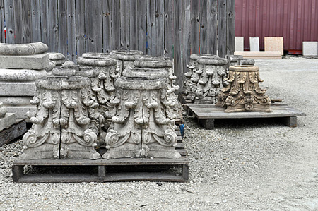
Esta dualidad encuentra un paralelo interesante en estudios que he realizado sobre la arquitectura transformada de la Habana o Arquitectura de la Necesidad como la he definido. Los cubanos, enfrentados a un déficit habitacional severo por la escasa producción y el envejecimiento de las viviendas existentes han transformado sus casas para adaptarlas a las nuevas exigencias familiares. Este proceso ocurre en un marco de discusión muy activo. Los arquitectos, los conservacionistas y cubanos en el exilio consideran a la Habana como una ciudad arruinada. La ruinología ha ganado adeptos, entre ellos al gobierno, que tiene beneficios vendiendo la imagen turística de la ciudad histórica. Las transformaciones a las casas son consideradas sacrilegios, crímenes contra la identidad de la urbe. Los arquitectos esgrimen el concepto de integración como una espada para modelar la Habana sin percatarse que tiene doble punta. He registrado proyectos arquitectónicos del gobierno que al intentar integrarse al contexto han debido, por el alto grado de transformación de la zona, asumir rasgos de la arquitectura transformada. El dilema es el siguiente, donde los arquitectos, nostálgicos y astutos vendedores turísticos ven polvo de ruina, los individuos con necesidades ven arena, materia prima para terminar el nuevo dormitorio que han creado al dividir la sala. Y este es el proceso que ensarta mis historias y reflexiones. En sitios de profunda necesidad el individuo mismo aplasta la memoria, la identidad, lo histórico y lo reduce a un conjunto de potencialidades físicas. Donde un nostálgico ve un capitel jónico, un icono de la ciudad histórica, un campo abonado para la retórica, el necesitado, que he llamado en otros textos el Modulor Moral[3], ve un objeto, un volumen de piedra, un cuerpo estable donde apoyar su nueva escalera.
Desde los años 90, durante la crisis económica que afectó a la isla tras la pérdida de los mercados socialistas europeos, los cubanos se vieron forzados a establecer nuevas relaciones con las tecnologías, objetos, materias primas. La reparación, recuperación y hasta la reinvención se volvieron tareas domésticas tanto como lavar la ropa o cocinar. De tanto abrir cuerpos el cirujano se desensibiliza con la estética de la herida, la sangre y la muerte. Y esa es la primera expresión de desobediencia del cubano en su relación con los objetos: un creciente irrespeto por la identidad del producto y la verdad y autoridad que esta identidad impone. De tanto abrirlos, repararlos, fragmentarlos y usarlos a su conveniencia terminó desestimando los signos que hacen de los objetos occidentales una unidad o identidad cerrada. El desacato ante la imagen acabada de los objetos más bien se traduce en un proceso de fragmentación en materiales, partes y sistemas técnicos. Es como si al tener un conjunto de ventiladores rotos pensáramos que tenemos un conjunto de superficies plásticas redondas, planas, gruesas y finas o motores, alambres, esquinas de metal, depende de cómo lo organices en tu mente. Siempre listas para ser usadas. Esta liberación, que reconsidera lo que entendemos como materia prima o incluso materias semifinis para enfrentarlas a la idea de materias objetos o materias fragmentos de objetos hace cierta omisión del concepto objeto en si mismo, en este caso del ventilador. Es como si tuvieran la capacidad de no ver sus contornos, las articulaciones y signos que semánticamente hacen el objeto, y solo vieran un montón de materiales.
El ventilador reparado con un teléfono, recolectado en la Habana en el 2003, diagrama esta ecuación. La imagen del objeto nos arrastra al campo de significados del arte, al readymade y al repertorio de recursos asociativos del dadá, o simplemente el humor que se articula en la imagen acapara nuestra mirada y entendimiento. Sin embargo, para el reparador el teléfono es la única forma, que siendo similar a la base prismática original, el podía acceder. Cuando el teléfono se rompió el no lo arrojó, la necesidad lo ha vuelto un hombre desconfiado. Este teléfono fue producido en la ex Republica Democrática Alemana, por lo que llevaría al menos 10 años bajo la cama o en un closet. Cuando el cuerpo de su ventilador se fracturó, quizás por una caída, la familia debió alarmarse, 45 grados centígrados de temperatura son condiciones agresivas, la imposibilidad de reponer el objeto, por la excesiva disparidad salario precio, cierran el diagrama. El debe asumir su reparación, la acumulación que ha sostenido por años tiene una existencia paralela en su memoria. Recuerda el viejo teléfono. Toma en consideración exclusivamente las cualidades físicas del objeto. Los ángulos y nervios plásticos internos que conforman este prisma de base rectangular, le aseguraran la estabilidad de su ventilador. Las asociaciones simbólicas que podrían aparecer tras la reparación son invisibles para él. El pragmatismo erige el cuerpo reconstruido del objeto adelantándose a cualquier intento de construcción simbólica. Pero no se trata de un menosprecio absoluto por el valor de las imágenes. La capacidad para reconsiderar como materia prima el mundo físico, aun el más elaborado, tiene su fenómeno paralelo en el universo de los significados.
Desde hace un par de meses cumplo con una comision del museo Vizcaya de Miami. En una conversación con la curadora, Flaminia Gennari, me comentó que decenas de jóvenes quinceañeras, cada año, utilizan el edificio y sus jardines como escenarios para la producción de sus memorias fotográficas y en video de su onomástico. El museo ofrece a cada una de ellas dos tickets gratis para regresar posteriormente a modo de visita profesional dirigida. Ninguna de ellas ha regresado jamás, al menos con esa intención. Las familias viajan al museo llevando a la quinceañera, varios vestidos, maquillistas, cámaras de fotos y videos. Cada espacio del edificio rebosa de significados. El lugar debe su valor museable al deseo acumulativo y aspiraciones aristócratas de James Deering, y a Paul Chalfin el diseñador que pretendió construir una villa veneciana ecléctica para su cliente en la bahía de Biscayne en 1916. Los distintos jardines, las escaleras, glorietas y balcones parecen los únicos lugares con historia en Miami. Cientos de chicas se hacen fotografiar en estos escenarios confiando que el edificio asegure la belleza y legitimidad de la imagen. Estas practicas en América Latina, tiene su origen en las costumbres de la alta sociedad de presentar a las jóvenes casamenteras en público buscando la aproximación de pretendientes importantes. Las imágenes de estas jóvenes aristócratas en la prensa local son reconstruidas hoy en lugares como Vizcaya, las poses responden a gestos corporales y maneras ya obsoletas entre las jóvenes de hoy. En la fotografías y videos el Vizcaya queda reducido a un background, aplastado como una lámina, una superficie elaborada y segura, sobre la cual se apoya la adolescente mientras el video familiar hace público el final de su niñez. El Museo Vizcaya debe su nombre al Vizcaíno Juan Ponce de León el colonizador que parece haber descubierto la Florida y que, por su búsqueda en este lugar de la fuente de la eterna juventud, devino una referencia e inspiración para las “colonización” que hizo Deering en esa zona floridana al construir edificios y jardines que se expanden como una pequeña ciudad. La manera en que los habitantes latinos de Miami usan Vizcaya parece confirmar la tesis caníbal de Oswald De Andrade pero esta vez sin un sentimiento claro de venganza, sin ningún componente ideológico expreso. Las culturas vernáculas devoran el signo como resultado, como ultima capa de evolución cultural y parecen indiferentes a su construcción social e histórica. Se trata de una reconversión en materia prima de aquellos signos culturales óptimos.
En su texto “Esquema general de la nueva objetividad”[4], Hélio Oiticica, apropiándose del Manifiesto Antropófago de Oswald de Andrade de 1928, específicamente del planteamiento que la cultura brasileña seria antropofágica por “la reducción inmediata de todas las influencias externas a modelos nacionales”, escribe: La antropofagia sería la defensa que tenemos contra dicho dominio exterior, y esta voluntad constructiva la principal arma creativa, lo que no impidió del todo una especie de colonialismo cultural, que de modo objetivo queremos abolir absorbiéndolo definitivamente en una Súper-antropofagia.
A ese estado de Super-antropofagia hemos llegado por razones diversas. La democratización o accesibilidad a las tecnologías como el video y la fotografía digital, el universo cada vez más expandido de lo genérico, de la no identidad, y la ubicuidad que habilita Internet, le han dado al caníbal la posibilidad de aparecer en cualquier punto del planeta, de devorar en Paris sentado en México, o a la inversa. Y quizás estamos en presencia de un giro dramático: la voracidad caníbal podría estar siendo devuelta?
[1] Glauber Rocha. Estética del sueño. Columbia University, New York, enero de 1971
[2] Werner Herzog. “Grizzly man”. 2005. Discovery Docs, Lions Gate.
[3] El Modulor Moral, a diferencia del Modulor le corbusiano, es un ser a la vez que una métrica. Encarna la potencialidad humana para entender la urgencia e inscribirla en el espacio. Suma, al orden de su pie, la dimensión moral que la necesidad rescata.
[4] Hélio Oiticica. Nova objetividade brasileira”, in: Museu de Arte Moderna, Río De Janeiro, 1967. (Traducción extraída de Helio Oiticica, Alias México 2009)
I International Caribbean Triennal
Santo Domingo 2010
1st September to the 24th October 2010
more info >
220°C Virus Monobloc
The Infamous Chair
Editors: Arnd Friedrichs, Kerstin Finger
Texts by Hajo Eickhoff, Max Küng, Andrej Kupetz,
and Alice Rawsthorn
Language: English
Publisher: Die Gestalten Verlag (September 1, 2010)
Release: September 2010 Available Soon!
Price: € 29,90 / $ 45,00 / £ 27,50
Format: 17 × 24 cm
Features: 192 pages, full color, softcover
ISBN: 978-3-89955-317-8
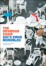
Monobloc is the established term for the ubiquitous stackable plastic chair that can be found on patios and in yards, snack bars and campgrounds around the globe. Although despised by design aficionados, it is arguably the most successful piece of furniture in the world. 220°C Virus Monobloc is an entertaining documentation of the love-hate relationship designers have with this chair. In addition to homage paid by renowned designers including Philippe Starck, Jerszy Seymour, Maarten Baas, and Konstantin Grcic, the book presents a range of work, photography, and art that is a tongue-in-cheek take on the phenomenon of this chair.

Liliam Dooley and Ernesto Oroza’s design are being produced
for the french luxury brand’s spring / summer 2011 collection.
-more info: designboom
Organized by Hermès and Designboom.
3rd ex-aequo prize in collaboration with Liliam Dooley
Designboom: we are now revealing the first, second and third place winners, whose designs are being produced
for the french luxury brand’s spring / summer 2011 collection.
‘cleverness patterned #2’ by liliam dooley + ernesto oroza
designer’s words:
‘our design is inspired by – and it also reinterprets – both the symbolic universe and the
graphic concept of Hermès ties. the tie, like the umbrella, the paper clip, the digital typeface
and the razor blade, belong to a very particular group of objects that have become classic due
to the brilliance of their design. our project aims to synthesize the aesthetic pleasure that results
from a blend of cleverness, austerity and functionality that good design entails.’


