Contemporary artist Ernesto Oroza re-presents “Archetype Vizcaya”
By Janna Lafferty, Vizcaya Museum & Gardens Examiner April 21st, 2011.
http://www.examiner.com
There is irony in Ernesto Oroza’s title, “Archetype Vizcaya.” He is less asking his audience to uncover something original and immutable then to point to the many folds of appropriation, redefinition, hybridity, and adaptation—processes of change—that first produced and continue to reproduce Vizcaya. For Oroza, Vizcaya provokes uneasy questions about the boundaries between production and reproduction, foreignness and indigineity, and the absoluteness of originality, authenticity, and meaning. Can reinvention, simulation, and syncretism be their own archetypes? Engaging these themes, Oroza puts the eclecticism of owner James Deering’s and designer Paul Chalfin’s architectural historicism into conversation with how he sees people variously using, thus re-defining, Vizcaya today. Among them, the museum’s methods of material conservation and Vizcaya’s popularity as a venue for quinceañeras.
Ernesto Oroza is a contemporary artist and conceptual designer from Cuba, whose work has enjoyed exhibition in galleries and museums across the globe, including France, Canada, New York, Spain, and the Netherlands. His work explores vernacular appropriations of material culture. As the artist currently commissioned for Vizcaya’s Contemporary Art Project, Oroza invites visitors to revizualize Vizcaya—to see elements that largely go unseen, emphasizing its layers of appropriation and hybridity. He accomplishes that in three ways.
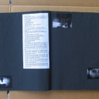
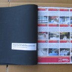
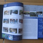
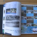
First, Oroza has created a “map” in the form of a fold-out brochure, which visitors pick up in the piazza of the main house. Inside, Oroza has created a cartography of otherwise obscure visual elements, creating a beautiful legend of patterns that come from the floors, terrazzos and other decorative objects throughout the house. Each snippet of visual design on the map is numbered, correlating to one of 41 rooms, so that visitors become explorers of unique visual patterns. All of them instantiate the ways James Deering and Paul Chalfin appropriated the design and art elements of particular times and places. The map itself becomes its own decorative take-home piece.
Secondly, Oroza calls attention to the plexiglass coverings that have been placed over certain elements in the home as a preservation measure. Oroza sees these as curious and invasive elements that assert new meaning and definition into this place. They are the kind of implements that transform a private residence into an institutionalized public space. On their surface, Oroza imposes his own invasion—his own subjective layers, placing silhouettes of invasive plant species known to threaten Miami’s native flora. It seems an obvious provocation of questions. To what extent do we understand “Villa Vizcaya” and its architects as invaders, bringing outside elements and planting them in the Miami wilderness?
Finally, a second-story room plays a looped video collage, cataloguing amateur videos of people who’ve set their quinceañeras and weddings in Vizcaya’s elaborate gardens–gardens that themselves simulate the renaissance garden layouts of Italy and France. By the time we are watching these families borrow Vizcaya and make it their own, we have a sense of how the inventors of Vizcaya did the same. The meanings attached to Vizcaya become layered and fluid, a place of pronounced bricolage in city of tremendous flux.
Ernesto Oroza’s installation continues through May 29th, as part of Vizcaya’s ongoing Contemporary Arts Project (CAP). CAP was established as a way for the museum to connect with the national and local art community, extending invitations for notable artists to interpret Vizcaya’s space and resources. The museum invites two artists to present work in and about Vizcaya annually, which is exhibited over several months. Flamina Gennari-Santorni works with a select committee of national curators to elect the artists recruited for commission in a given year. The project helps to make Vizcaya a living, evolving social space. Oroza’s work especially demands self-reflexivity, not only emphasizing how the museum’s efforts to preserve a history itself creates and is created by its present, but that tensile relationships always mark that existence. To be living means always grappling–but, hopefully, not becoming complacent–with paradox.
Mapping Vizcaya
Written By Anne Tschida APRIL 2011
Biscayne Times
IN HIS LATEST WORK, CUBAN ARTIST ERNESTO OROZA NAVIGATES THE FAMED ESTATE’S HISTORY, BOTH REAL AND IMAGINED
Visiting Vizcaya Museum and Gardens is a quintessentially Miami experience. The view of Biscayne Bay is spectacular. The gardens are lush and tropical. And the interior design of the faux Italianate villa is so over-the-top, so wannabe A-list as to be, well, so Miami.
The house was built by one of South Florida’s first transplanted tycoons, a product of the Gilded Age, James Deering. He wanted his mansion to look as though it had been around for centuries, like a real Old World landmark. So in 1916 he had his designer, Paul Chalfin, appropriate a mish-mash of styles from the 16th to 20th centuries for the new structure.
James Deering, a Gilded Age tycoon, found Miami to be the perfect place for his visions of faux grandeur. Photos courtesy of Vizcaya Museum and Gardens.
In 1953 this quixotic specimen of grandeur and excess — really, a Disneyfied version of a European castle, years before anyone had even heard of Uncle Walt — became a museum, run to this day by Miami-Dade County.
This history, simultaneously real and imagined, organic and borrowed, captivated Ernesto Oroza, a Cuban-born artist who spent a year walking the museum. The more he walked, the more he noticed the quirky secrets of the villa — on the floors, the walls, and even in the mix of visitors flowing in and out. Oroza eventually came up with Archetype Vizcaya, the latest in the Contemporary Arts Project series commissioned by the museum.
Oroza has literally mapped out the normally unseen highlights of Vizcaya in an artful brochure, which includes a legend with numbers and symbols. On a sunny, cool day, he points out some of his explorations.
When he first started making his rounds, he says, he noticed what was constantly under his feet: the floors made of marble, terrazzo, wood, tile, different styles all shoved together, sometimes in a single room. In particular it was the marble that really caught his eye. It is, he explains, the ultimately “contaminated” material. Over thousands of years, minerals and weather have infected the stone, imposing on it that unique quality of veins running through it. “To mineralogists, these shapes that we consider beautiful are, in fact, impurities that invaded the rock,” Oroza explains. “Any piece of marble in Vizcaya may be considered the diagram of a similar process of contamination that has occurred during the life of the building.”
And, he adds, marble shouts out wealth, another central theme of Vizcaya. From ancient times until today, marble columns, sculptures, and especially floors have signaled to visitors that money and power inhabit a space. And Vizcaya is covered in it.
Modeled on 17th- and 18th-century Venetian floors, the marble layerings in the villa were imported, likely from North Africa, another way for moguls like Deering to flag wealth “and worldly experience,” says Oroza. “It was from the beginning meant to be a showroom.”
Vizcaya was designed in the era of Cecil B. DeMille, and any resemblance to a larger- than-life movie set is intentional.
As you move from room to room with Oroza’s map, you see the beginnings of Miami as a place where outside influences and manufactured identities dominate. We reinvent ourselves here all the time. “History” is malleable. Pasts are remade or just erased.
Take the Breakfast Room. It is decorated in a pseudo-Chinese style, popular in the late 19th Century, with lacquered furniture (actually crafted by a Cuban team) and a painting of a South China Sea fishing scene (actually painted in the late 1600s by a Frenchman). As the new deputy director for collections and curatorial affairs, Flaminia Gennari-Santori, who is overseeing the art series, quips: “Look closely. One of the fishermen was really born in 1916!” The original painting was expanded to fit the wall, which meant adding figures and subjects. Talk about imposition and contamination.
Other stops on the map reveal subtle points that would go unrecognized without some help from Oroza, such as details in the 550-year-old rug depicting the “Hand of Fatima.” Oroza’s own interventions are few, and are pasted on Plexiglas barriers in certain rooms: silhouettes depicting invasive plants that have been imported to Miami through the years, endangering the native vegetation. The Plexiglas itself is its own, strange intervention, says Oroza — something that jumped out at him, like the floors. When the villa became a museum, these Plexi plates were installed to keep visitors from harming valuable objects or venturing too deep into the rooms. But as Oroza points out, they were haphazardly placed, in some cases protecting relatively unimportant works, while other more precious pieces stood completely exposed.
A third segment of this unconventional art exhibit involves Oroza’s “mapping” of the people who have passed through Vizcaya over the past half-century. Using the Web, he gathered amateur videos of quinceañeras, weddings, parties, and star-studded concerts, which unspool in a continual loop (Oroza adds to it when he can) in the South Gallery. This study of human interventions at the site leads him to understand something else about Miami. As a relatively recent arrival from Cuba, Oroza says he had never visited the museum. But once he started hanging out, he saw how central the place has become to the local Cuban community, another important layer in Miami’s multilayered history.
From Deering to Chalfin, from the property’s African and Japanese plant species to exile families celebrating coming-of-age rituals — and even the hands behind this exhibit (the Cuban Oroza and Italian Gennari-Santori) — Vizcaya reflects so many of the influences that make up the broader cultural terrain here.
Oroza has devised a clever way to uncover all this. As Gennari-Santori writes in the exhibit’s introduction: “The map directs us to look at the surfaces beneath our feet and, in doing so, breaks our normative viewing habits and frees us to participate in an intensive treasure hunt for curious artifacts. Oroza’s map is an object in its own right that can be taken home and enjoyed as a piece of art or wallpaper, or in any way one wishes.”
Archetype Vizcaya is a highly conceptual work from a very intellectual mind, but it can be engaged on almost any level. If you’ve never been to this amazing museum, here’s your excuse; follow the map through the house, or just take the opportunity to wander and stumble on some interesting tidbits.
Oroza gathered amateur videos of parties, weddings, and galas held at Vizcaya, which unspool in a continuous loop.
Circling back to the idea that Vizcaya was, from its inception, supposed to be a showroom, Oroza points out it was designed in the era of Cecil B. DeMille, and any resemblance to a larger-than-life movie set is intentional. “It was made to be photographed,” he says. “It was made to be catalogued.” And of course it was made to be explored.
A progress report on the ongoing renovations at Miami’s Vizcaya Museum…
By Beth Dunlop Special to The Miami Herald, 2011/04/10
Vizcaya’s entrance loggia with its interesting floor is on the explorer’s map of the estate that Ernesto Oroza devised as part of his art project, ‘Archetype Vizcaya.’
Ernesto Oroza’s new contemporary art project, Archetype Vizcaya, is a puzzle and a treasure hunt. It’s part of a series that offers artists the opportunity to look at Vizcaya through a unique contemporary lens, a chance to interpret, intervene or even invent: temporary new work — some of it extremely conceptual — layered over aging beauty. As such, Oroza’s work offers an enlightening new way to look at and learn more of an extraordinary and complex house built by James Deering, the heir to a giant farm-equipment fortune, and completed in 1916. Archetype Vizcaya offers a perfect metaphor for the moment, for place and time.
Vizcaya Museum and Gardens is one of this country’s most important historic houses — for its architecture, decorative arts and gardens — and among the most beautiful. It is also one of the most complex. Almost every element bears scrutiny and understanding, and only now are its curators and caretakers beginning to unlock its many secrets.
In many ways, Vizcaya is at a turning point. Just five years shy of its centenary and almost six decades after it be came a key part of Miami-Dade County’s cultural holdings, it is getting a fastidious, piece-by-piece examination and — where needed — restoration. The magnificent Sutri Fountain at the far edge of the garden and long called the Rose Garden Fountain, has just been restored (by Conservation Solutions, Inc.), along with the important, and delightful, garden sculpture surrounding it.
The café and gift shop, much damaged in 2005 during Hurricane Wilma, are renovated (by R.J. Heisenbottle Architects) and will reopen in June. The David A. Klein Orchidarium just outside the café and grotto swimming pool is being returned, by the landscape architects Falcon + Bueno, to a condition more like its original so that a small lawn fringed with ornamental plants yields to a hammock. Two of the quaint Vizcaya Farm Village buildings across the street have been restored, also by Heisenbottle. A cultural landscape report (by Heritage Landscapes) that documents the historic horticulture of the gardens has just been completed.
Within weeks, possibly sooner, design work will begin to replace the heavy-handed black-metal glass space frame roof that covers the courtyard, a legacy from the 1980s. The archives have been organized — for the first time ever — and, even more important, each painting, sculpture, rug, chandelier, sconce, fitting and piece of furniture is being studied and catalogued. Last fall, Vizcaya introduced an audio tour in English and Spanish, which enables visitors to wander knowledgeably at their own pace.
And, from now through May 29, there is Ernest Oroza’s magical map to follow. The map comes in the form of a fold-out brochure. Open it, and there are numbered icons drawn from patterns in the exquisite, intricate floors. The icons in turn relate to 41 different rooms in Vizcaya and, sometimes, to particular objects, forcing the visitor to seek out patterns in the floor and hidden images and iconography in the furniture and architecture. In this engaging and enigmatic work, past is prologue, and the present is multi-layered.
The map is just part of the project. Oroza also has added a layer to certain rooms, Plexiglas panels with designs that pose the question of what’s authentic and what’s not — appropriate in a house in which most of the furnishings and fittings were antiques bought in Europe and shipped to what was, in 1916, still an outpost of civilization in the New World, with some pieces reassembled for uses far from their original intent. Oroza wants us to think about these issues, then take our observations even further.
His project ends in a makeshift gallery where a continuous video loop shows some of the ways that Vizcaya is used now — most particularly in footage of girls bedecked in gowns posing for their Quinceañera photos. All of this is heady and intelligent and, at the same time, capricious and full of joy.
Oroza’s fascination with the balance between a venerable historic house and its perception (and use) by the larger public points up some universal truths, most fundamentally that humans are drawn to beautiful places and spaces and when something like Vizcaya can be theirs — even for a moment — they make it so. A century, a culture and much more separate James Deering from the 15-year-olds in the Quinceañera photos, and yet both have borrowed from the grandeur of another era to make it their own. In Deering’s case, the borrowing was for a lifetime; today, often, it is for the hour spent shooting a portrait.
Oroza wants us to think about this. Follow his map, follow his path, watch the videos, and you will.
The Contemporary Art Project is funded by foundation grants and private donations. Artists are selected by a prestigious jury, most of them curators from widely regarded museums across the country, in conjunction with Vizcaya’s deputy director for collections and curatorial affairs, Flaminia Gennari-Santori.
“We’re not a contemporary art institution,” she says, “but we see this as a way to reinforce ourselves. The context here is so strong that it can create a way of re-thinking.”
Gennari-Santori. and Vizcaya’s director, Joel Hoffman, have Ph.D.s in art history and are dedicated stewards of the rich treasure that is Vizcaya, and they also fully understand that dichotomy between the once-private, grand mansion of one of this country’s richest men and the public museum that it is today, preserving the all-important work of its architect, F. Burrall Hoffman; designer, Paul Chalfin, and landscape architect, Diego Suarez, and paying homage to their collective brilliance. Even more, they are public stewards of a building and collection of enormous scholarly and aesthetic importance — and learning . Theirs is a rigorous and daunting task.
The magnificent Sutri Fountain, for example, had been installed incorrectly in 1920 (Gennari- Santori. suspects that the workmen confused inches and centimeters) and thus always leaked. Restoration involved not just cleaning it but also removing and re-setting it to fit. The fountain, which Deering and Chalfin bought from an antiques dealer in Rome in 1916, had been in the piazza in the small Italian town of Sutri, just north of Rome, and was most likely was designed in 1722 by Felippo Barigioni whose other work included the fountain in the Piazza de Pantheon in Rome.
This detailed level of scholarship importantly provides a basis for understanding not just a specific piece but also the whole intricate interrelationship between house and garden, furniture and art. Moreover, it provides a base line for restoration work and for decision-making — for example, in the refurbishment of the storm-damaged café.
In the café and gift shop, which have been operating from a tent, diners and visitors will get a glimpse (woven wicker, dark wood, leaded glass) of what would have been Deering’s gaming and smoking rooms and can see some details of the original (sconces, rails, marble), but the rooms are more or less a necessary adaptation to a new use. Peer through the windows to see the grotto pool (look, but don’t swim) which has seamlessly gotten new flood-control engineering.
Time and wear, weather and climate all play into the decision making about Vizcaya’s future — that delicate balancing act. After Hurricane Wilma’s damage, Hoffman convened a charrette to look at alternatives to the almost 30-year-old glass canopy over the Vizcaya courtyard. Several options were explored — among them a glass wall dividing the courtyard from the house, a lower glass “ceiling,” the zoning of the house to air-condition rooms — under the theory that technology has advanced enough to allow for a more minimal and elegant solution than the ugly black space frame. Ultimately, the simplest of alternatives emerged: replacing the roof with a lighter, closer-to-invisible glass roof. It’s a much-needed step, and a critical one, paying homage to the real architecture once again.
In the meantime, there’s an entirely absorbing and entertaining way to look at Vizcaya — through an artist’s eyes and through your own. It’s a testament to the power of Deering and the men who created this remarkable house and gardens that it is all, always, a discovery, be it new scholarship, restoration revelations or simply the product of close examination. What’s clear is that going forward into its second century, Vizcaya is in good hands — cherished and honored and celebrated. And cared for and conserved. What more can we ask?
Villa Vizcaya transfigurada: entre la quimera y el diseño
Janet Batet. El nuevo Herald, Publicado el domingo 17 Abril del 2011
Como parte del programa Contemporary Art Project (CAP), el Museo de Vizcaya presenta hasta el 29 de mayo, Archetype Vizcaya, proyecto del artista cubanoamericano Ernesto Oroza.
En Archetye Vizcaya Oroza creó una cartografía que transfigura la mirada del visitante proponiendo una nueva lectura de la famosa villa italiana en Miami.
Para el proyecto, Oroza escogió el plexiglás como elemento central por dos motivos esenciales. La primera, histórica: cuando la villa devino museo en 1953, las láminas de plexiglás funcionaban como frontera limítrofe que delimitaba el espacio y los objetos exhibidos de los visitantes; segundo, por ser el plexiglás el material más contemporáneo empleado en la construcción del edificio.
Las láminas de plexiglás devienen estructura arquitectónica provisional, pobladas con la silueta de plantas consideradas hoy “invasivas” que, posiblemente, hayan sido introducidas en la Florida por James Deering, dueño de Villa Vizcaya, y que actúan a un tiempo como elemento decorativo e interferencia en el proceso perceptivo.
Construida en el mismo momento en que se elevaban los rascacielos de Nueva York y Chicago, Villa Vizcaya contrasta como poder simbólico escapista que mira a Europa y al pasado. En este sentido, Oroza sustantiva el extendido uso del lugar como mero decorado y quimera para ocasiones como es el caso de las populares fiestas de quinceañeras.
Ernesto Oroza. Viscaya Museum and Garden, Miami
by Janet Batet. Arte al dia International
As part of the Contemporary Art Project (CAP) program, the Vizcaya Museum presented “Archetype Vizcaya”, an exhibition by Cuban-American artist Ernesto Oroza.
Ernesto Oroza is well known for his incisive commentaries on contemporary urban culture. With a background that includes deep conceptual roots and a solid training in design, Oroza appropriates a space or an aspect of the urban environment and, through a deconstructive process, he returns the object he has manipulated entirely transfigured.
In the specific case of “Archetype Vizcaya”, the artist explores the shift in meaning which has its point of departure in the de-contextualization and redirecting of the gaze. To this end, Oroza created a “provisional space” delimited by Plexiglas panels that function as a “parallel” structure within the museum’s architecture. There are two essential reasons behind the choice of Plexiglas as a central element in his work. The first is of a historical nature: when the villa became a museum in 1953, the Plexiglas panels functioned as a frontier that kept the space and the objects exhibited separated from visitors.
The second reason, associated to the synthetic nature of the material, imposes an essential contrast with the rest of the build- ing which stands out for its escapist vocation. Built at the begin- ning of the 20th century − coinciding with the start of construction of the New York and Chicago skyscrapers − the marvelous villa stands out for its evasive character, revealed by its appropriation of 16th century Italian Renaissance architecture at a time when architecture and design opted for technological advancement and the incorporation of ultra-modern materials. Oroza sets his use of Plexiglas against the use of marble as an invasive and contaminating element. As the artist rightly points out, marble is “the result of a process of contamination of limestone rock by a flow of magma.” Based on this concept, Oroza devotes himself to a compilation of all the invasive processes the villa has been subject to throughout its one hundred years of existence. Within this process, he highlights the inventory of “invasive” plants from the most remote confines that populate the villa and emphasize the notion of escape that distinguishes the venue. From this detailed classification, Oroza utilizes the formal element. The leaves, reduced to silhouettes, invade the crystalline surfaces of the Plexiglass, acting at the same time as decorative element and interference in the perceptive process. “Archtype Vizcaya” is accompanied by a map in which Oroza reveals historical details of interest, articulating the building’s dual function. Since while the complex was conceived as a summer house commissioned by James Deering, its designer, Paul Chalfin, cleverly used it for his own self-promotion, transforming the mansion into his own personal
portfolio.
To illustrate this “parasitic” use of the building, Oroza draws attention towards the extended utilization of the place as a mere décor and chimera for the popular fifteenth birthday celebrations, reducing the complex − in the same way as Chalfin did − to a décor for personal purposes. To emphasize this effect, the map-catalogue created by Oroza fulfills a double function. On the one hand, the fundamental one of guiding the visitor in this unusual tour of the Vizcaya Museum; on the other hand, there is the mere decorative character. The symbols used at the back − as an indication of the language employed − become a mere ornamental pattern, in such a way the catalogue displayed on the wall may be used as a decorative wallpaper.


